Showing posts with label Digital Art. Show all posts

Wednesday, October 01, 2014

New Challenges

This year, the Aquarium of the Pacific opened a new exhibit about steelhead trout (Oncorhynchus mykiss). Because I don't know a lot about steelhead, I had a lot of research to do, which mostly involved a lot of google searching. However, in this case, I had the privilege of working with the actual fisheries scientists from USFW and regional fisheries scientists, which meant I also was able to supplement my photo reference with images and input from the scientists.

One of the things I was tasked with was creating an image for the steelhead life cycle, which is exceedingly complex because all steelhead start as eggs in a freshwater stream and as they grow older they can choose to stay in the freshwater and become what we call rainbow trout or they can can transition—in a process called smoltification—into the ocean-going form known as steelhead trout. To make things even more complicated, steelhead trout transition in freshwater to rainbow trout colors, but don't become rainbow trout. And they can return to the stream year after year to spawn unlike salmon. So yes, the big takeaway is that rainbow trout and steelhead trout are the same species.

This process started out with a sketch from Rosi Dagit from RCDSMM (Resource Conservation District of the Santa Monica Mountains).


The initial Illustrator/Photoshop image based off Rosi Dagit's design:


The initial design looked too complicated on reflection, so we simplified it.
Another part of the process was to send out an image of all the trout life stages to the scientists for their review. Here you can see the various notes that were given on an initial version of the illustrations and a later version of the illustrations after I'd made the changes.


Here's an image that shows a rough progress.
The first image is a rough sketch, in this case of the steelhead (ocean-going form of the rainbow trout). For the ease of changing the outlines and scale of the various stages of the trout, I did all the "inking" digitally. These are vector images drawn in Adobe Illustrator and colored in Photoshop. It's hard to see the difference between the first outline and the second, but there were minor changes in the mouth shape and a general slimming down of the overall shape, since steelhead tend to be more streamlined than rainbow trout.


Here, you can see the final image, where includes a change in the title and a more pared down look. The background of the image reflects the exhibit so I made minor modifications there as well.


Next post is a little glimpse of what it takes to create a composite photo, without it looking too Photoshopped. Visit the Aquarium of the Pacific to see the new Steelhead Trout exhibit and the new signage in person!

Friday, May 31, 2013

Giant Siphonophore

A giant siphonophore (Praya dubia) is a colonial Cnidarian like the Porteguese man-o-war. It can get up to 130 feet long and can be found at up to 1000 feet deep. Each of the small animals are connected together and have different functions like feeding, swimming, and reproducing. The "head" or swimming bell is the nectosome and the long "tail" is the siphosome. These guys can bioluminesce a blue color to attract their prey. The giant siphonophore is part of the Aquarium of the Pacific's new exhibit on Ocean Exploration called Wonders of the Deep. Since the images of these animals of their full length are mostly low-resolution ROV video captures and since the original designs called for a 40 ft image, I decided to illustrate the animal instead of going through the frustration of Photoshopping, cloning, and blowing up itty bitty pixels. Illustration gave me the flexibility to play around with the size of the image to fit the context and also to blur or clarify the parts of the image that overlapped or went behind other Photoshopped photos. This first image is the final image as it went to pre-press, with the images from the different sections and two walls put together. The illustration was built at 1/8" size.


Here's a close-up of the front of the siphophore, with the nectosome and some of the siphosome showing.


And here is the image in the context of the Wonders of the Deep Gallery. The projections above it show animals that live in the abyssal plains, 13,000 ft down. The siphophore isn't one of those animals, it's more an element to tie together the different panels. Sorry for the poor quality of the photo. It's an appropriately dark exhibit.


If you find yourself in Long Beach, come check out the new Ocean Exploration exhibit at the Aquarium of the Pacific!

Friday, February 08, 2013

Putting together the whole

I suspect that people working as illustration editors for magazines do this kind of thing all the time, but I thought it might be interesting to take a look at what I get handed before I start an illustration. This is a post touching on the process behind creating an illustration from existing materials.

While it's essentially a tracing job, it's not quite as straight forward.

What you get is this:

What they want is this:


I created this image for a forum on planning the use of marine space off the California Coast. It's officially called coastal marine spatial planning (CMSP). You can read more about the forum here. It's a vector image created in Adobe Illustrator with a map base created in GIS software and additional data added. I put reference links to the original image where possible.

This is the original map:

You can see the general shape of the land mass in the image. The shape of the coastline is directly pulled from this image. However, since the final image was reproduced at 8' wide, I added more detail to the map using other maps of the Southern California area.

 This is a reference image that I used to create the oil platform icon:
 

And this is the reference for placement of the oil platforms:

I used this map for the Marine Protected Areas (represented in green) and the state boundaries (represented in blue):
http://noyonews.net/wp-content/uploads/2012/07/SoCal-MLPA-Map.jpg

Federal boundaries (represented in purple) and shipping lanes (teal) were traced from a nautical map:
found here: http://www.fairwind.org/charts.shtml

And the final layer was of Areas of Special Biological Significance (ASBS) represented by an outline of the Garibaldi (yellow):
http://cordc.ucsd.edu/projects/asbs/

Just a little look behind the scenes of everyday illustrations, making science and data more beautiful through art.

Friday, July 08, 2011

Concept Art

In this post I talk about concept art, another example of why you would use an illustration as opposed to a photograph. Concept art is the physical form of an idea, used in my job to make a case for funding, for fellow employee's to visualize what they're planning, and for fabricators to visualize what the aquarium would like in the final product. The concept art that I do is usually quick and dirty and isn't as beautiful and thorough as that found in the breathtaking vistas of the concept art for games; it's mostly to have something physical to look at to get a better idea of what everyone is looking for. Most of the time, the final product doesn't resemble the original art and sometimes the image is as far as the idea goes.

To make the process faster, I've used Google Sketchup as a base for most of my concept art. Sketchup is very useful for plugging in real-life measurements and being able to get perspective lines and a sense of the space. The final art is mostly digital for the ease of revisions, but sometimes, I also get to use watercolor for that traditional architectural rendering look. Here's just a few of the projects I've worked on over the past few years.


This is the Sketchup version of our now open Ocean Science Center. Done 2 years before the actual space was opened.


Here is the Photoshop rendering, based on the Sketchup model. You can see that the overall layout and positions of most of the people are based on the model. I had a lot of fun trolling through the internet for fashion ideas to clothe the simple Sketchup models. Also, as requested, the people in the final rendering reflect the diversity of our guests. I had more time than usual to render this one, about 2 weeks. This image was used as part of the funding request and as a glimpse of the up-and-coming exhibit.


Another simple Sketchup model used as the base for the final rendering. This is of a potential otter play structure.


I've learned a lot about rendering rocks in this job. This one was a little experimental, trying out some Photoshop brush techniques that I first worked with on the Harbor Reef computer mural. This one was fairly rough, maybe a week or less to render with a few revisions thrown in. So far, I haven't actually seen this structure made.


Here is a Sketchup model of our new rock shrimp habitat. The Sketchup rocks gave me a rough idea of how much space a particular-sized rock would take up.


The final Photoshop rendering. I'm pleased with the way this one turned out because the real-life structure actually resembles my rendering.


We are changing out an existing exhibit to make way for penguins! Here is the Sketchup rendering that I used as the basis for my final rendering.


One of the few times I got to break out the watercolors. This rendering is done in watercolor and graphite and was shown at our fundraising event "Aquarium After Dark" to give everyone a glimpse of what the penguin exhibit might look like when it is finished next year.

I have a lot of fun with these concept renderings because they are a challenge to make sure I get everything the client wants in the image and because it's a little like making your own world in miniature.

Friday, September 03, 2010

Garden Signage: Non-Plant Illustrations

Here are a few close-ups of the non-plant ID images used in the Garden signage.

Food waste that can be used for composting. This image was a simple pencil sketch composed from various photos and colored in Photoshop.


Compost and worms. Again, a simple sketch composed from various worm and compost photos, colored in Photoshop.


Organic pesticides. Usually when I do a vector image of an existing object, I start out with a trace of a photo of the object, usually low res, and adjust accordingly.


A close up of the home with the programmable drip irrigation box. Composed from various Illustrator and Photoshop elements.

Friday, August 27, 2010

Garden Signage

Here following are the Aquarium's garden signage, which feature my plant illustrations and vector drawings. The first two are used out in front to talk about our drought tolerant garden, designed to match existing signage in the front and the other one is used behind-the-scenes at our compost bin, designed to match our other BTS signs.


Wednesday, May 26, 2010

Water Wise Plants for the Home Garden

The Aquarium of the Pacific had it's official opening of its Earth-Friendly Garden on Earth Day 2010, featuring drought-resistant plants. The goal of this project was to show a variety of plants that had low water usage and that also looked beautiful, encouraging guests to plant a few in their home garden. I did the illustrations for the signs and based the layout on existing signage. Ahead are just a few of the many beautiful choices for a drought-resistant garden.

Foxtail Agave
Agave attenuata


Blue Fingers
Senecio mandraliscae


California Lilac "Blue Cushion"
Ceanothus "Blue Cushion"


Douglas Iris
Iris douglasiana


Jester Flax
Phormium tenax "Jester"


Spanish Lavender
Lavandula stoechas "Otto Quast"


Carmel Sur Manzanita
Arcostaphylos edmundsii "Carmel Sur"


Rock Rose
Cistus "Sunset"


Cleveland Sage
Salvia clevelandii "Winnifred Gilman"


Next time, a post of the actual signs and some plant illustrations from last year for the Watershed Exhibit website.

Friday, February 12, 2010

As I Sail On

Here's the latest large art project I was involved in for work. It's a sail-like banner for the Aquarium's Shark Lagoon, currently hanging on the elevator tower. Actual size is ~8' x 13'. Original was a sketch that was colored in Photoshop. I've only got a digital file of it now; the photos I took on the day it went up turned out too dark and grainy. Better photos of the actual sail to come.

Tuesday, April 07, 2009

Instead of Wallpaper

A while ago I posted a couple of images I did for a mural of the Sea of Cortez, the Vaquita and the totoaba. I finally got around to taking a photo of the mural. Here's the main section. It's about about 12' wide and 9' tall. There's another portion on the opposite wall where the Baja peninsula is blown up, but the lighting is pretty bad in that gallery.

Currently working on another mural, larger than the last, at 42' x 8' though the wall dips down to 5' for about 20' of it, so that's why the mockup has a strange shape. I will post more about the process as this mural goes along.

Thursday, June 28, 2007

Work-art


A rendering of a 4 year grant project from work, started by my old coworker
and rerendered with his initial thoughts by me.
So, actual size is 4' x 2', made in Adobe Photoshop and Illustrator.
Includes elements of scanned sketches, actual photos, and token Sketchup models.
Right, so my workplace owns this one.
I might post a detail at a later point.

Sunday, May 13, 2007

Diversifying the Portfolio


Haven't put up a werewolf in a while. This one's been sitting in my unfinished folder for a while. A few things off with the anatomy, but overall, I rather find him quite dashing. Titled simply: Jump.

Still more to do on the pic, some polishing needed, but rather like this one. Done in Painter with a somewhat imagined background and based off an old sketch I did while at my old job.

Saturday, March 17, 2007

In Comes Some Art


So some stuff from Corel Painter. I will post here first and throw them up on DevArt tomorrow or so. Keep in mind that they are stuff a little rough around the edges, as they are from my vastly huge unfinished folder. These just happen to be a little more finished than the others.

Saturday, September 23, 2006

For Your Eyes Only


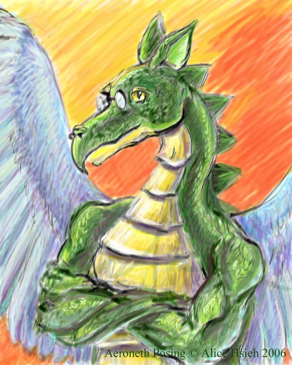
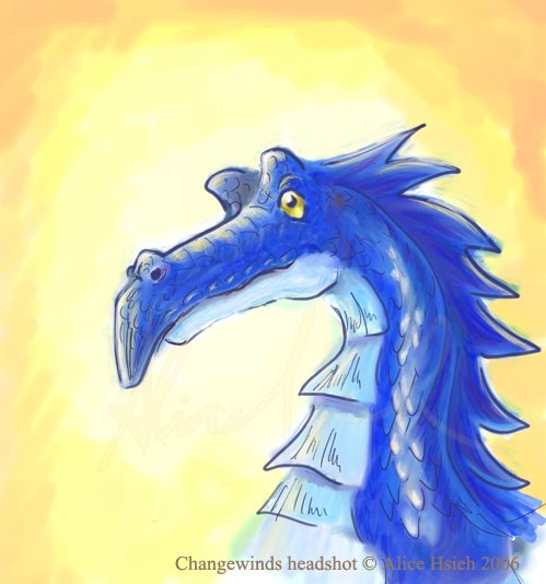
Wee! Tablety goodness. Here's Aeroneth, another of my dragon characters. Note: Aeroneth and Changewinds both have rather simplified forms since they've been around a long time, i.e., their look is pretty much the same as what they first looked like with a few years of improvement. Anyway, Aeroneth is a Gandalf, Yoda, Merlin, Carolinus-type character. In other words, his absence promotes character growth. If you had an all-powerful wizard around all the time, you wouldn't get into much trouble now, would you?

Sunday, August 27, 2006

Strolling in on a Draft


So this is for those crazy friends of mine who believe that it is easier to show art on a blogger. Go fig.

Also visit:
Kathy Jaramillo
Mary Lai